Grid on WYSYWIG Forms Editor

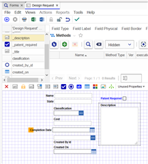
I'd like this added to the body style of the iframe that is loaded in the Forms Editor (html.html_edit_form body.claro.body_edit_form).


background-size: 12px 12px;
background-image: linear-gradient(to right, #2000ff30 1px, transparent 1px), linear-gradient(to bottom, #2000ff30 1px, #fff 1px);
background-repeat: unset;

The result is the grid you see. I think this would be a nice UX enhancement that might turn on/off from some control in the editor toolbar.

Parents
  • Wow cool! I also tried this once ago but didn´t get that far! I actually wanted to build some kind of snap grid for positioning - but failed. I right now always assign x/y positions directly for each field. 

    As I can see in your picture you use left aligned labels for your field. Maybe you already know this one. This small CSS helps to align these kind of fields much more easily:

    Just add it to the 'Form Body' tab (Innovator 12):

    .sys_f_label_left,
    .aras-field__label
    {
       width:200px;
    }

    The code defines a fixed size for the label container. This makes it much more easier to align fields with left aligned labels.

  • Thank you for the tip! I would really really like to understand how to make Innovator recompile the CSS files into the used .min.css files, or just adjust the "Form Body" tab to always include such a snippet - so it becomes a default for all forms.

    I think it funny that the form builder has mismatch, unaligned, different font, elements. I think that reflects the attention to that area. I'd like to improve it.

Reply
  • Thank you for the tip! I would really really like to understand how to make Innovator recompile the CSS files into the used .min.css files, or just adjust the "Form Body" tab to always include such a snippet - so it becomes a default for all forms.

    I think it funny that the form builder has mismatch, unaligned, different font, elements. I think that reflects the attention to that area. I'd like to improve it.

Children
No Data