
One thing that irks me is submitting a form that isn't complete and not having an indication of what is missing until after attempted submission.
We could color all the labels differently than the non-required, but I really wanted an asterisk in red to use just a little bit of contrast that is more relaxing to the user's eyes.
What can I say; I'm an Innovator...
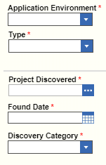
Here is the result of styling individual labels using sudo selector ::after
...and here is a sample for various components that I put in the "Form Body" CSS:
/* dropdown select label selector */
.sys_fn_type .aras-field__label::after,
/* calendar label selector */
.sys_fn_pr_found_date .sys_f_label::after,
/* textarea label selector */
.sys_fn_pr_description .sys_f_label::after,
/* checkbox label selector */
.sys_fn_rc_investigation_required .sys_f_label::after
 {
content: " *";
color: red;
}
Hope that helps somebody. I think it looks great. The non-required fields are apparent now (I didn't screen shot the entire form) and the required fields are evident at a glance.
Lastly, I should mention that using pseudo selectors ALWAYS requires a "content" attribute - even if it is an empty string - or it won't show.
EDIT: Well, we need to tell the user what it means just incase they are from another planet, so I'll use ::after again, but on the whole div of my last element:
.sys_fn_prob_res_act_disposition::after {
    content: "* indicates required fields";
    color: red;
    display: inline-block;
    margin-top: 1.5em;
    text-align: right;
    /* I couldn't achieve the placement result I wanted with right padding or margin, so I had to use width percentage */
    width: 96%;
}
Voila!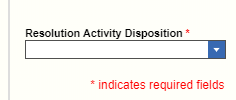
BONUS: See the light grey line (#ddd) above "Project Discovered"? That's using the pseudo selector ::before!