

As we discussed in our recent blog post, Getting Started with Graph Navigation, the new Graph Navigation feature introduced in Aras Innovator 11 SP15 is a quick way to visualize your PLM data. In this post we'll dive deeper into the functionality to explore how we can style, open, and package our Graph Views. To get the code samples and Graph Views shown in this post, check out the Intro to Graph Nav community project on the Aras Labs GitHub.
Custom Graph Styling
The style and layout of a Graph View's content is determined by an item called a View Card - we briefly covered these items in the Getting Started with Graph Navigation blog post. Now we'll take a closer look at how they work. Each View Card has a Template Definition property containing a JSON object string. This JSON object is what the graph viewer uses to determine the style and format of content in the graph. In this section we'll review how we can use the View Card's Template Definition to style this Ad Hoc Graph View Definition from our last blog post.
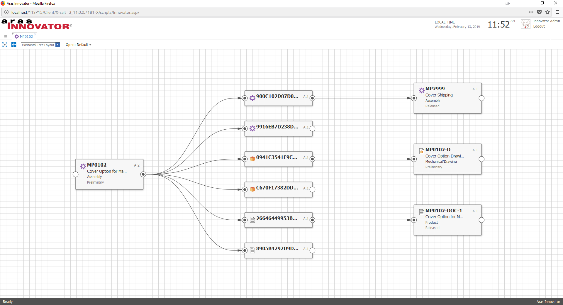
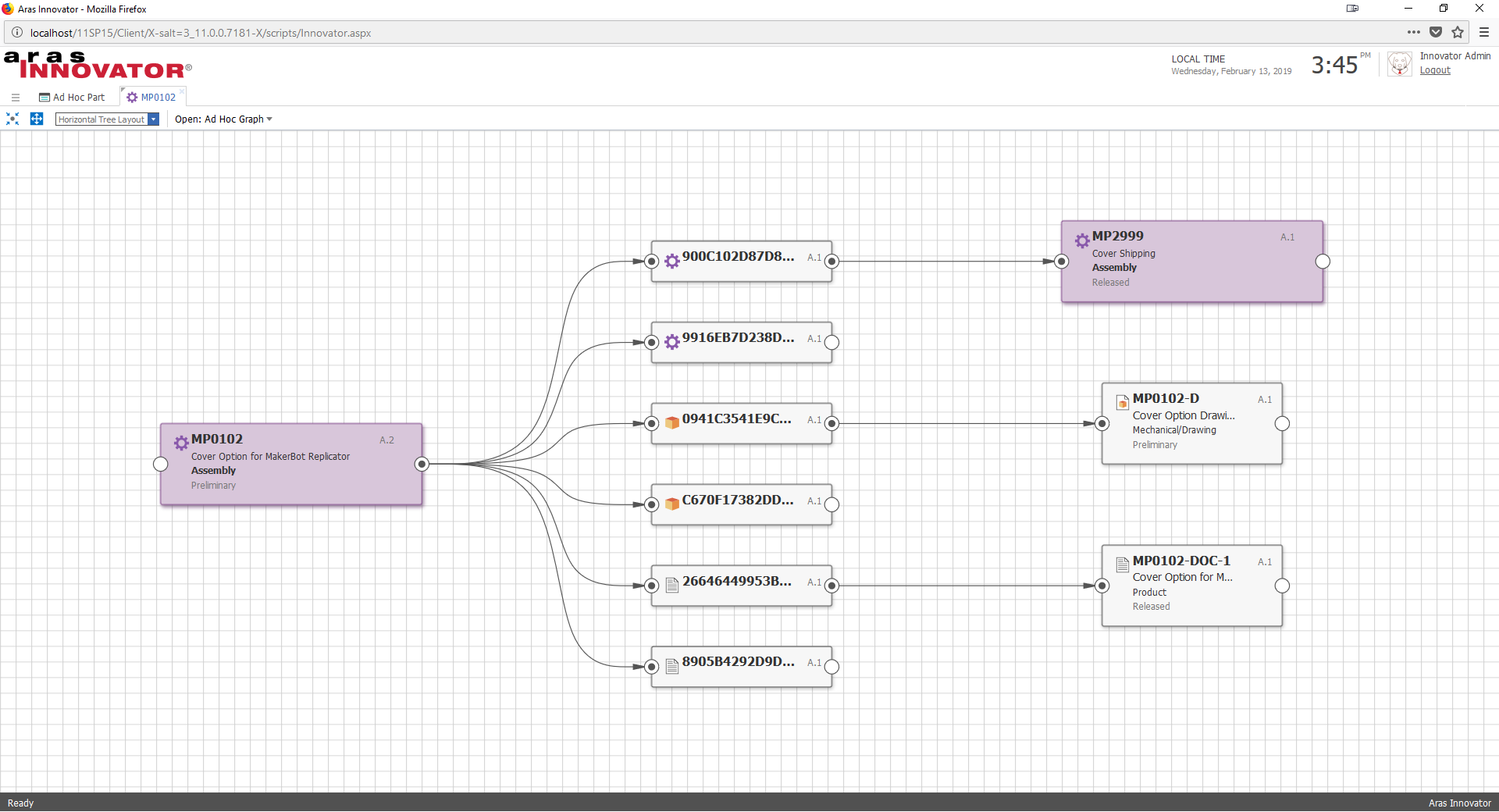
Here's what the Ad Hoc Graph View looks like without any View Cards applied:
Creating a View Card
Now let's build out a View Card to style Part items. We'll start with a generic sample from the Graph Navigation Administrator Guide.
- Navigate to Administration > Configuration > Graph Navigation > View Cards in the TOC.
- Click the Create a New Item icon to create a new View Card.
- Add a name and description to the View Card.
- Paste in the Template Definition from the code snippet below.
- Save the View Card.

Now that we have a View Card, we need to relate it to our Graph View Definition.
- Navigate to Administration > Configuration > Graph Navigation > Graph View Definitions in the TOC and open the Ad Hoc Graph View Definition.
- Click the Default View Cards tab.
- Click the Add New Relationship icon to pick a related View Card.
- In the search dialog, choose the View Card you just created.
- In the relationships grid, set the ItemType Id property to the Part ItemType.
- Save the Graph View Definition.
Now we have a good starting point for our custom node, however if we open up our Graph View it will look a lot like the default style provided by Aras Innovator out-of-the-box. We need to make some changes to the template JSON to make the graph look more interesting.
Customizing Node Style
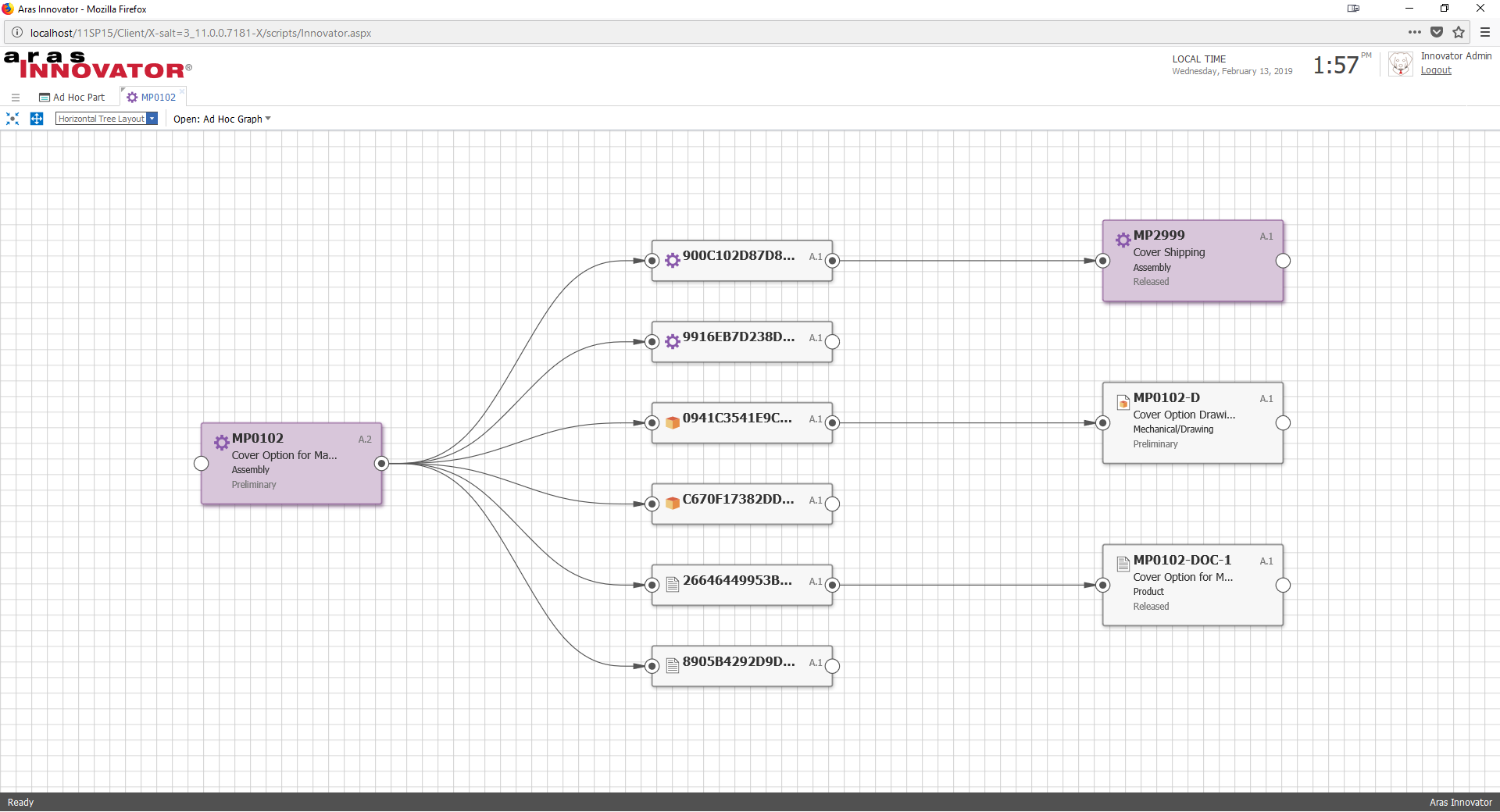
First, let's modify the color of the node - this will help users more quickly identify items within the graph view. The container.style object in template JSON contains properties for styling the background color, border color, and shadow color. Let's change these colors to mirror the purple color of the Part ItemType icon:
- container.style.color = "#D8C6DA"
- container.style.border.color = "#895591"
- container.style.border.shadow.color = "#411348"
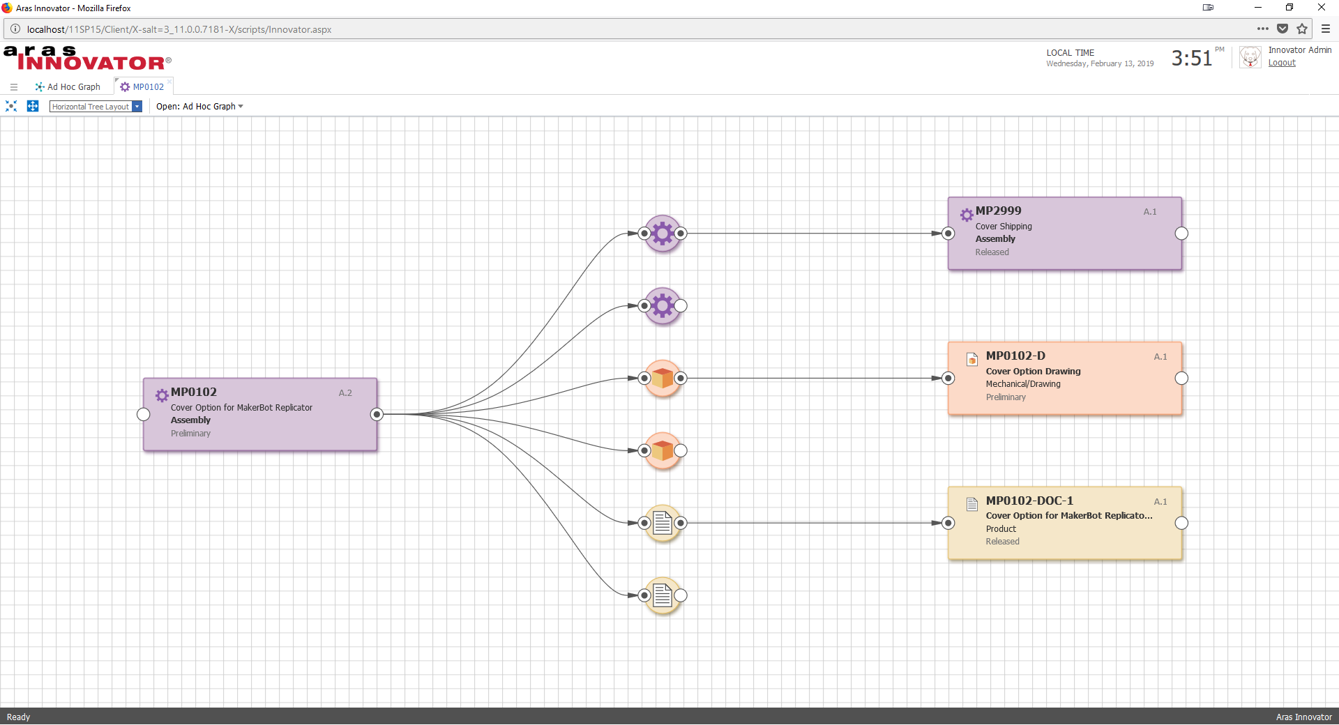
After updating the Template Definition and saving the View Card, our template JSON should look like this and the graph should look something like this:
Now the styled Part nodes stand out in the graph view, but we have a request from users to make the card wider to show more of the item's name. Let's use the template JSON to modify the layout of the node content.
Customizing Node Content
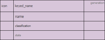
Think of the contents of a graph view node as a simple table. Each View Card describes the table with an array of row objects, an array of column objects, and an array of cell objects. If we drew out the table for our current View Card, we'd get a table of four rows and three columns with the content determined by the container.style.cells array.
If we want to make the name column wider, we just need to increase the width property of the second column object in the container.style.cols array. Let's change it from 120 to 190.
We also need to adjust the overall dimensions of the node to accommodate the increased column width. We can do so by updating the container.style.width property to 290.
Once we've updated the template JSON and saved our View Card, our graph should reflect the wider node dimensions:

We can also modify the template JSON to add rows and columns or show different property data in the node, but now we have another user request - shrink the Part name text and make the classification font bold.
Customizing Content Style
To customize the style of the node content, we need to locate the cells we want to update in the container.style.cells array. Once we've identified the cells, all we have to do is update the style object for each cell. For example, here is the cell that displays the Part item name:
{ "content": "text", "content_binding": "name", "col": 1, "row": 1, "style": { "font": { "size": 12, "family": "Tahoma", "weight": "normal", "color": "#333333" } } }To shrink the font size used for the name cell, we can reduce the size property to 10. Similarly, we can change the weight property of the classification cell to "bold". After updating the template, our graph should look like this:
By applying these techniques we can configure graph views in any number of ways. Here's the same graph view with additional View Cards configured for the Document and CAD ItemTypes, as well as their relationships to Part.
Create a Custom "Open Graph" Action
By default, the gn_ShowGraphView action opens the system ad hoc view and allows the user to select other views via select list in the viewer toolbar. However, you may have a use case where you know exactly which graph view you want the end user to see first. For this scenario, we can create a custom action to show a specific graph view. All you need to do is plug the id of your Graph View into the sample code below, create an Action that uses the method, and attach the Action to your ItemType.
Update (11/5/2019):
In 12.0, the syntax for loading a graph was updated slightly. The original snippet provided in this blog post works only for Aras Innovator 11.0 SP15, so we have added another snippet to the Gist that contains the code needed to create a custom action in 12.0+.
Packaging Graph Views
Just like other configuration metadata in Aras, you can package up your Graph Views to import into another Aras Innovator environment. To ensure a complete export and clean import of the package, be sure to include the following items in the package definition:
- Graph View Definitions
- View Cards
- Node Types
- Connector Types
- Node View Definitions
- Connector View Definitions
- Any Query Definitions used by a Graph View Definition
Note that you might not have all of these items for every Graph View. A simple Ad Hoc Graph View may only need to include a Graph View Definition in the package. For an example of a packaged Graph View, check out this community project.
Looking for More Aras Inspiration?
Subscribe to our blog and follow @ArasLabs on Twitter for more helpful content! You can also find our latest open-source projects and sample code on the Aras Labs GitHub page.