


One of Aras Innovators greatest strengths is its ability to visually connect pieces of data from different parts of the product and the product lifecycle. Without seeing a visual representation of this "Digital Thread", it might be difficult to see how interconnected your data is. Aras’s Graph Navigator allows you to quickly and easily see those connections and shape your decisions around that information. The thing that sets Graph Navigation apart is the fact that it’s all using live data. You can use each node to navigate to the Item represented by the node. The graph is generated at runtime, using a Query Definition as its backbone. This means you can set up a view, which will change and grow as your data changes.
The Basics
Making visual changes based on live data is a great way to ensure someone taking a quick look at your visualization can easily glean the important info. This blog will go over how to customize your Query Definitions and Graph View Definitions to accurately reflect current data. I’d recommend reading our previous blog about Customizing Graph Views as I’ll be skipping parts of the process covered in that blog.
This blog will go over how to color code your documents based on their classification. While this is a very simple example, it shows the fundamental process you’d use to visually differentiate based on live data.
The Set Up
To follow along with this blog, you will need a part which has at least two different documents attached to it. They will need to be of different classifications with one being product and one being general. The first step in creating a Graph Navigation is to make a Query Definition, which is where we’ll start.
Query Definition
To begin, we’ll create a new query definition which has its root item as the Part ItemType. We’ll select the properties we would like to display in our graph. Next, we’ll add a document to the query through the Part Document relationship.
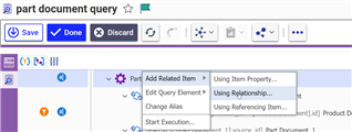
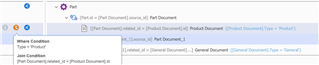
And then we’ll add another! Since we need to be able to branch based on live data, we’ll need two different item definitions for Documents. Do not reuse the same item definition, as we’ll need to set different filter conditions on each. We’re going to go ahead and apply those filters now. We’ll set one to only display if the Type property is set to “product” and the other to only display if it is “general”.
Graph View Definitions
Once you’ve set up your Query Definition, we can move on to creation of the Graph View Definition. I’ll be using a community project called View Card Editor to make changes to the view cards within our graph view. Once you create a new Graph View Definition and select your new query, press save. You’ll be prompted about creating a view card for every item, and for treating relationships as connectors. Say yes to both and move on.
If you open up the graph view at this point, you’d notice that all documents look the same, regardless of their classification. This is because both of our query items are pointing to the same default view card. To give each query item its own view, we’ll need to create a new Node View Definition.
Each query item has it’s own view definition. A Node View Definition (NVD) allows you to update the table above to reuse view cards across multiple query items. We’ll be creating two custom NVDs for the two different types of document.
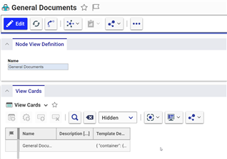
Our first step is to duplicate our existing document view card. I’ll apply a save as to the original, and then rename it so it’s clear which view card is which. Once I have two, I’ll update the color of the card, and make sure the two have different colors. I’ll color the Product Documents green, and the General Documents blue.

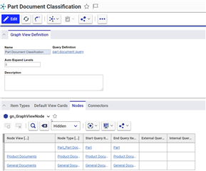
Once we’ve set up our view cards, we can create our Node View Definitions. Each NVD has a relationship to a view card. The image below is what my NVDs look like. Link your newly created view cards to your NVDs and then we’ll move back to the Graph View Definition.
Back on the Graph View Definition item, visit the nodes tab. Here we can see an entry for every type of node. Here we can link our NVD, which will change the view of the view card. The below image is the end result.
Now when we attempt to load our new view we should see our updated and colorful graph!
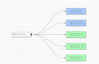
And there we have it. We were able to define a view which queries live data, and displays different classifications of documents in different colors. This is a great way to create quick views, that can be checked at a glance.
Conclusion
The ability to query live data and display it in an easy to digest format is a powerful tool. People can easily understand what’s going on, even in areas they might not be as experienced. Let us know how you think your company could utilize a view like this!